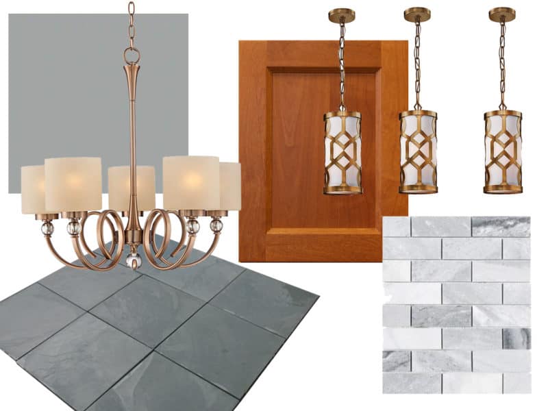
Thanks in part to the holidays and the busyness of actually doing home renovations I haven’t posted an update on our home renovations in almost 3 months! I will be starting my very first attempt at tiling in my new kitchen on Monday so I thought I’d better squeeze in a catch-up update on the overall kitchen design, at minimum, before launching into DIY tiling updates. This is part I of my kitchen posts because, thus far the kitchen is still in the conceptual phase – my design is completed but my cabinet order is still being finalized. Thankfully (for me and other kitchen lovers) there will be lots more fun things to share on the kitchen front going forward!
Phase I – Design Notes
Before getting into the details of what my kitchen aesthetic will be I feel like I should clear up what it will not be! That is, it will not be an all white kitchen. In, fact my cabinets will be (gasp!) natural wood and white will not play a role in my design at all. Now, I’m well aware that in making this decision I am on the wrong side of a very serious kitchen design trend. I don’t believe I encountered even one non-white kitchen while flipping through home design magazines for inspiration and I’m not sure you can be an HGTV star if you aren’t an all white kitchen evangelist! And, while I understand some of the appeal – clean and streamlined, easy to accessorize, etc. – I’m not sold. First off, I am wary of sweeping trends in general. Very rarely is one style or design appropriate for every application; massive trends usually result in the forced application of that particular style where it has no business being. I also tend to think that big trends go out of style in a big way, when they finally do. Secondly, I just love natural wood plain and simple. In fact, if I had to pinpoint the number one principle that guides my design choices, it would be the use of natural materials. Natural materials have a depth and subtlety, of both color and texture, that can’t be recreated by human hands, no matter how hard we try. In this vain, white just feels too sterile and somehow flat to me so I rarely find myself drawn to it. Thirdly, every house has an existing style and feel, no matter how deeply you gut it. Thus, respecting the bones of the house as well as the unique setting (woods, city street, suburban cul de sac etc.) is crucial to a harmonious, natural feeling finished product. Tucked into the woods with a red brick exterior, fireplace, and old fashioned split levels, a sparkling white kitchen just doesn’t feel right for the personality of this property. (I’ll be delving into my overarching design for the whole house in an upcoming post so stand by for that!)
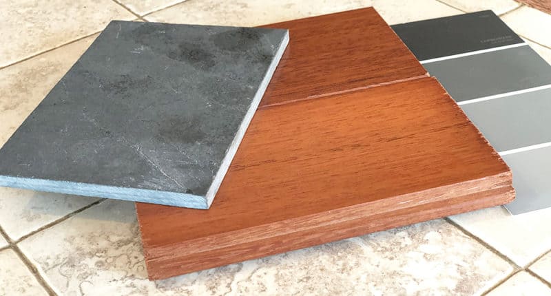
That being said, there are also pitfalls to using natural materials. Everyone has been in a room that feels oppressive from the overuse of dark heavy wood or a room that is bland and one-note with too many warm neutrals. Even the beautiful, lightly stained cherry wood, that I chose for the cabinets, could end up being overwhelming if not balanced out with cool tones and clean lines. The key to a beautifully designed interior, as I see it, is picking a few show-stoppers and then assembling a supporting cast around them. I knew I wanted wood cabinets from the start but my vision for the space didn’t really come together until I came across the striking Montauk Black Slate tile pictured above. While I was instantly drawn to the tile I second guessed myself incessantly on the decision. I have always loved grays but I usually stay away from very intense values in general, preferring many harmonious tones over attention grabbing bold ones – and an essentially black floor is a pretty bold choice! Ultimately I couldn’t shake it though; no matter how many other, more subtle, alternatives I looked at I kept being drawn back to the Montauk Black Slate. And when I did finally pull the trigger on it, so to speak, the other pieces fell easily into place. The current trend towards warm, soft grays, tinged with other colors is one I am willing to get behind with enthusiasm and my slate floor paved the way. I ended up mixing grays with subtle green hues, and grays with subtle purple throughout the whole house and I love them!
So if everything comes together as I envision it, the matte gray tones of the walls and backsplash, and the simple lines of the cabinet doors will allow the natural warmth and glow of the cherry wood to shine. And, the ornamental polished brass light fixtures will offer a subtly elegant counterpoint to the deep tones and rough texture of the striking slate floor. And it will all play together to create a beautiful, cohesive whole. We will find out I guess! 🙂
Functional Layout
I love choosing pretty materials and finishes but I may be even more passionate about functionality! I think the most beautiful designs are also the most functional. An interesting principle that I learned many years ago in one of my art classes is that the human eye is able to unconsciously detect inefficiencies in physical forms (whether it be a gravy boat or an automobile.) We instinctively know when the form of a thing is not following its function and we instinctively don’t like it, even if we don’t know why! By the same token, we are all drawn to efficient streamlined designs, even if we can’t articulate exactly why.
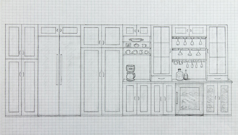
With this principal in mind I used a “functional station” approach to guide the layout of my kitchen cabinets and appliances. Taking into account the constraints of the space, traffic flow, and proximity to one another, I attempted to optimize each station for its specific function. The coffee and wine stations pictured above are obvious examples but more subtle, utilitarian applications are also tucked into every corner of the design. However, before deciding on the specific details of each station or zone, I had to be certain that the overall layout of the space itself was being utilized efficiently… and I found that it most definitely was not!
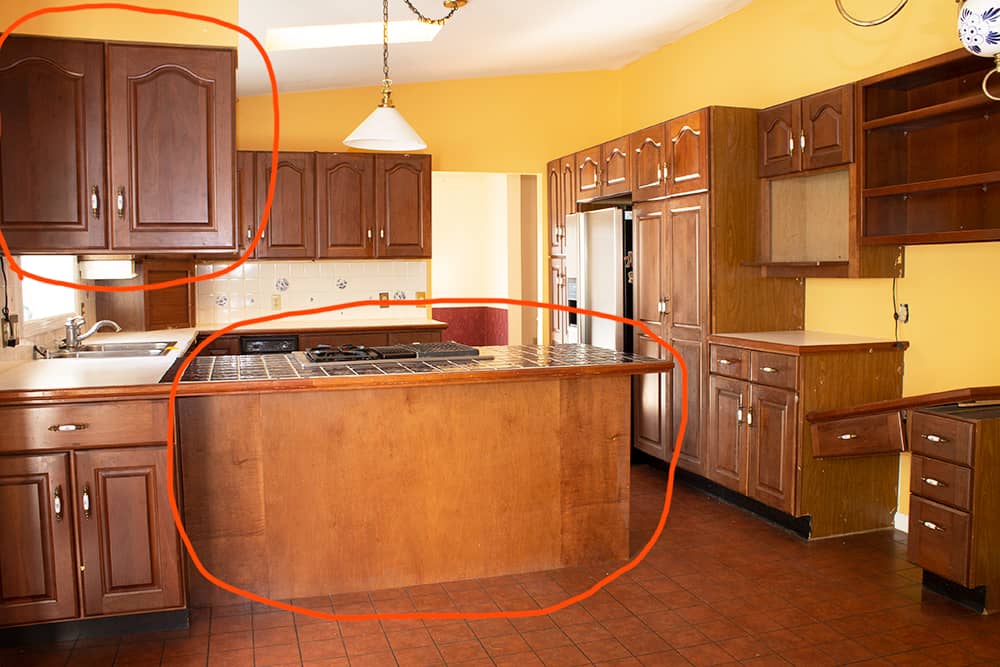
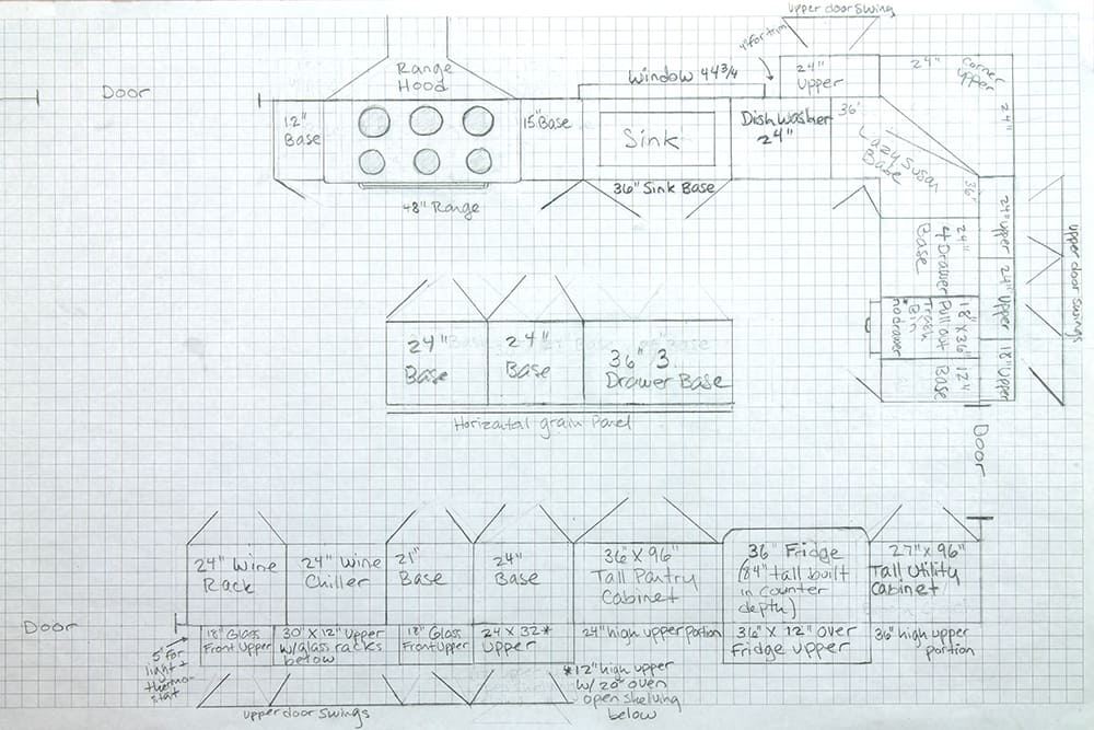
The biggest change that I made to the floor plan as a whole was opening up the closed off square configuration of the kitchen by eliminating the counter seating peninsula (shown above) and instead running a prep island (no seating) along the center of the room the long way (as shown in my new floor plan above.) The seating at the peninsula was redundant and unnecessary as there is a large in-kitchen dining area just behind it (shown in the photo below) and the formal dining room is adjacent to the kitchen. The resulting original floor plan essentially crammed the kitchen into one end of the room to accommodate counter seating at the peninsula and a large in-kitchen dining room, with a formal dining room only a few feet away! It just didn’t make sense spatially or functionally so I eliminated the counter seating, ran a narrower island, the long way, tucked the in-kitchen dining area against the wall with a breakfast nook table and extended the long cabinet runs on either side of the room to each respective doorway – maximizing storage and countertop space while at the same time making the room feel more open.
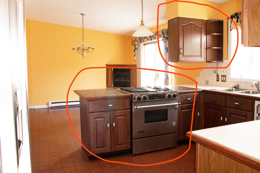
The oven/range was also originally built into the peninsula which I never liked but of course eliminating the peninsula necessitated finding another location for the range regardless. I ended up placing it on the wall between the window and door as shown below (the island is not shown in the elevation drawing below as it’s actual placement would partially obscure the view of the cabinets/range on that wall.) I have always thought I might like to have a professional sized double oven someday – anyone who has ever tried to make a large roasted meal and have everything come out hot at the same time can understand! And after doing loads of research on the ins and outs of different sized ovens, wall ovens, cook-tops and every possible oven/range combination/configuration known to man, it became clear that indeed what I wanted was a 48″ double oven and that we would not be able to afford a 48″ double oven, of any sort of quality! And by all accounts, buying a lower quality 48″ range (which is still very expensive) isn’t worth the inevitable headache of maintaining a poorly designed, very large appliance! So I made it my mission to find a high quality, used 48″ range at an affordable price – if such a thing existed! After much searching, and a good number of dead-ends I was finally fortunate enough to find a lightly used 48″ Viking double oven on craigslist for less than a third of what it would cost new! The only catch was that it weighed 500 lbs and had to be picked up 3 hours away! But that’s a story for another day – I’ll be tackling appliances and buying on craigslist (or other discount sites) in another post but suffice it to say I’m pretty thrilled with my 48″ Viking range and can’t wait to use it!!
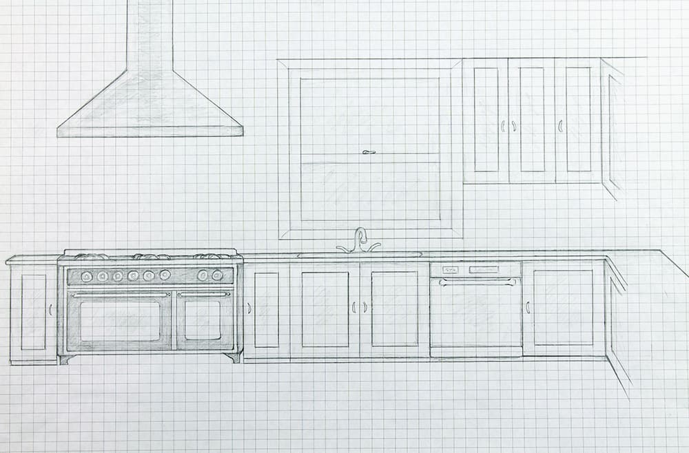
Circling back around to the concept of designing for functional stations or zones, my next step – after ensuring the overall layout was maximized for efficiency – was to identify my known constraints and build out zones from there, envisioning each zone’s specific use as well as its relationship to the zones around it. For example, I knew from the start I would not be able to move the sink or the dishwasher due to the existing plumbing and as it turned out the only real option for the range was to the left of the sink where I ended up putting it. The fridge could have been placed closer to the sink and range on the short wall (shown to the right in the above drawing) however this would have eliminated a great deal of prime countertop space and it wasn’t possible to fit the tall utility and pantry cabinets I needed on either side of the fridge on that short wall and separating the fridge from the tall cabinets wasn’t an option. I ended up keeping the fridge essentially where it had been – on the wall opposite the sink, flanked by the tall utility and pantry cabinets (refer to the drawing at the start of this section.) Once the locations of the major appliances are determined it’s easy to go from there. Designing upper cabinets wide enough to comfortably accommodate plates, cups, and bowls near the dishwasher is of course a no-brainer but there are also lots of more interesting ways to apply the concept. The island is a great example – its central location places it within a few different zones and the first easy choice was deciding that the doors should open towards the range and sink to service those zones. I divided up the 7 foot island into two 2 foot cabinets and one 3 foot cabinet. The two 2 foot cabinets are directly facing the oven and are designed to be roomy enough to house pots and pans, and each include a shallow pull-out shelf to keep pot tops organized. The remaining 3 foot cabinet will have 3 deep drawers that I plan to use for food storage containers and related items like plastic wrap, rubber bands, masking tape, etc. with dividers to corral all the lids! I might be as excited about my food storage container drawer idea as anything else! I can’t be the only one who thinks having an avalanche of food storage containers fall on your head every time you try and pry one out of the cabinet is a drag! Although anyone who knows me well could rightly call me out if I didn’t admit that I’m also pretty excited about my wine station! When Shane and I built our cottage, I bought high end cabinets out of a spec home off of craigslist and used what I could to lay out the kitchen. By a happy accident I ended up short a two foot wide base cabinet and while wondering what I was going to put in that space, stumbled across a 2 foot wide floor model wine chiller, deeply discounted at Lowes! It is now one of my favorite features at the cottage so I decided to not only include one in our new kitchen but design a whole wine station around it, complete with a built in wine rack cabinet to store wine not being chilled and glass racks. I defined the area by flanking the designated counter space above the chiller with two tall, glass front cabinets, perfect for storing more glasses or liquor bottles and mixers (shown in the elevation sketch at the beginning of the section.) That will definitely be a fun one to set up and test out, when the time comes! 🙂
Money Saving Tips:
Quality Materials for Less – Kitchen Edition
As I mentioned in my first post about this home renovation project, I like finding creative ways to get high end materials at a discount, and I’ll be detailing some of those ways as I go.
Cabinets
CRAIGSLIST: As I mentioned above, I bought a set of lightly used cabinets off of craigslist for our new construction cottage project 6 years ago and designed our kitchen around them. This mostly worked out well, although I did end up having to order a handful of new cabinets from the manufacturer to fill in some gaps and that ended up being quite a project, with color matching, etc. They also turned out to be very high end cabinets so the handful of new cabinets I had to buy cost about 5 times what I got the whole lot for! We still ended up saving a lot of money and my kitchen turned out beautiful but there are definitely some pitfalls to consider with this approach that I wish I had known then! I will be writing a separate comprehensive post about buying on craigslist and other second hand sites because that is a topic in and of itself but I will summarize my cabinet buying rationale for this project here.
While I did keep an eye out, this time around, for high quality lightly used or showroom model cabinets on craigslist and a site called Renovation Angel, I ended up ordering new cabinets through a company called Kahle’s Kitchen’s out of Pennsylvania. My dad is a dealer/contractor for these cabinets so he is able to get them at the wholesale price. If I had found a set of cabinets, second hand, that fit the space nearly perfectly I may have gone that route but short of that scenario I was looking at complications and considerations that would end up eliminating the craigslist cabinet’s cost advantage over the wholesale price of the new cabinets. Sometimes it’s practical to consider moving walls and generally changing the configuration of the kitchen and adjacent rooms to fit a set of cabinets if they are exactly what you want at the right price but in this case that didn’t make sense – changing the configuration of our kitchen/dining room/living room would have created at least one, too small or awkwardly shaped room, so that option was out.
READY TO ASSEMBLE (RTA): Another option I considered and may have gone with, if I hadn’t been able to get the wholesale pricing at Kahle’s, was Ready To Assemble (RTA) cabinets. If you are a DIYer or have a low cost contractor available, RTA cabinets may be something to consider. RTA cabinets come in pieces that must be assembled on site. This approach saves on shipping costs and allows the manufacturer to offer direct-to-consumer, lower cost, standardized cabinets. This is a growing industry and I did some research on RTA manufacturers and found that there are quite a few now offering high quality (all wood) cabinets! What you give up, aside from the convenience of pre assembled cabinets, is some customization, however some of the bigger players in this market are offering a lot more standard options than they did a few years ago. Also, it’s good to remember that a skilled contractor should be able to use filler pieces of wood to fit standard sized cabinets into most spaces.
BUILDING MATERIALS AUCTIONS: I have never actually bought cabinets from a building materials auction, however I have followed quite a few and find that the considerations are similar to craigslist with a few differences. With a building materials auction you will often get more professional information on the cabinets before you bid on them – such as a floor plan, itemized list, and materials specification. The cabinets are also going to be new rather than used, however, the only cabinets I have ever seen on these auction sites are mid-level-quality – no very high end cabinets. On craigslist there is a great deal more uncertainty and risk involved but with it comes the possibility that you might find a real gem like the cabinets I found for the cottage!
Flooring
CRAIGSLIST: Buying flooring from craigslist is possible but I’ve found that you are unlikely to find a good deal on a large quantity of flooring. This make sense as those selling flooring are most often selling off small remnants from a larger project.
ONLINE DISCOUNT SITES: There are a number of large online discount sites out there but my favorite for building materials is BuildDirect. Back when we were building the cottage, I found they had the lowest prices on things like stainless steel sinks and faucets so I kept them in mind for this project. After doing a lot of searching I ended up finding my black slate tile at BuildDirect for just $2.75/square foot, on sale! Slate tile, is usually anywhere from $5.00 – $10.00/square foot depending on the type so this was a great deal! You won’t always find exactly what you’re looking for on these sites but if you’re willing to be open minded about your material choices you may just find something really good on sale.
Backsplash, Paint, Backerboard, and other misc. materials
LOWES & HOME DEPOT: While Lowes and Home Depot don’t specialize in high end brands you shouldn’t rule them out when looking for deals on quality materials! Often they do have one or two high end brands mixed into their selections and they run incredible sales a few times a year. I have found that the best sales they run are around Black Friday, Fourth of July, Memorial Day, and Labor Day. We took advantage of the Black Friday week sale that Lowes runs after Thanksgiving and loaded up on all the essentials, like sheetrock, backerboard, thinset, and paint. I also happened to find a marble mosaic backsplash tile I really loved along the way! The backsplash tile was originally $12.98/square foot but with the huge sale and quantity discounts we ended up paying a fraction of that price. You can view the backsplash tile here on Lowes website. By virtue of their size and market clout, Lowes and Home Depot are also able to offer competitive financing options, which can really come in handy when trying to manage cash flow for a large project!
Appliances
CRAIGSLIST: I will be writing a separate, in-depth article about buying appliances on craigslist and other second hand sites because there are so many things to consider on the subject, however, I’ll give you a quick overview here. I’ve already mentioned that I found a lightly used 48″ Viking range on craigslist for less than a third of what it would cost new. I’ve found that the key to finding something that is high quality and still in good shape is casting a wide net with search terms and carefully considering the source and the story behind why the item is being sold. The story/scenario should add up – if it seems too good to be true it probably is. For example, I bought the Viking range and a Thermador counter-depth fridge from a contractor who renovates extremely high end homes in the Hamptons. The scenario is this: because money is no object for this contractor’s particular type of customer, it is routine that the customer wants to pull out a perfectly beautiful kitchen, with appliances, in order to redo the whole thing in the style they prefer. Thus the contractor offers the customer a small credit towards the job to take the appliances off their hands and then is able to resell them at a deep discount. This all adds up from a market stand point. In this particular case I got very lucky on the Thermador fridge as it happened to be brand new! It was a floor model (so already discounted) that this contractor bought for a particular job that ended up getting cancelled midway through when the customers decided to get a divorce rather than continue with their renovations! Slightly sordid circumstances of course but a very good deal nonetheless!
ONLINE DISCOUNT SITES: If I hadn’t ended up finding a great deal on my appliances through craigslist I probably would have purchased my appliances from a site called Designer Home Surplus. Their business model involves buying up warehouse inventory remnants, out-of-box returned items, and even items with slight cosmetic damage from big retailers and then offering them at a 40%-50% discount. This type of store is like any other discount warehouse store – you won’t necessarily find exactly what you’re looking for but you may find a really great deal if you’re willing to be a little flexible.
Light Fixtures
I’ll be covering lighting choices for the whole house in a separate post but the site where I ended up finding nearly all my light fixtures was an online retailer called Lamps Plus. I had not run across this site previously but I stumbled upon it after not finding what I was looking for on either Wayfair or Overstock. I loved the selection at Lamps Plus, whereas I found myself not liking almost anything I found on the other sites and the prices were about the same! I would definitely recommend checking Lamps Plus out if you are in the market for light fixtures.
Conclusion
That concludes my Phase I Kitchen design post – lots more to follow! Most immediately, “adventures in tile laying” starting Monday – yikes! Should be some interesting updates to post on that front. 🙂 Also, any comments, feedback, suggestions or advice anyone else has to offer from their own projects is more than welcome!